Figma component
Beta
Show details
Overview
The Progress bar shows how far a task has gone. It is used in the File tile during an upload and can be used on its own for any task with a measurable progress.

Key features
- Determinate: the fill reflects a known value.
- Indeterminate: an animated segment for work of unknown duration.
- Feedback: Neutral while the task runs, Success when it completes, Error when it fails.
- Value label: optional percentage next to the bar.
Anatomy
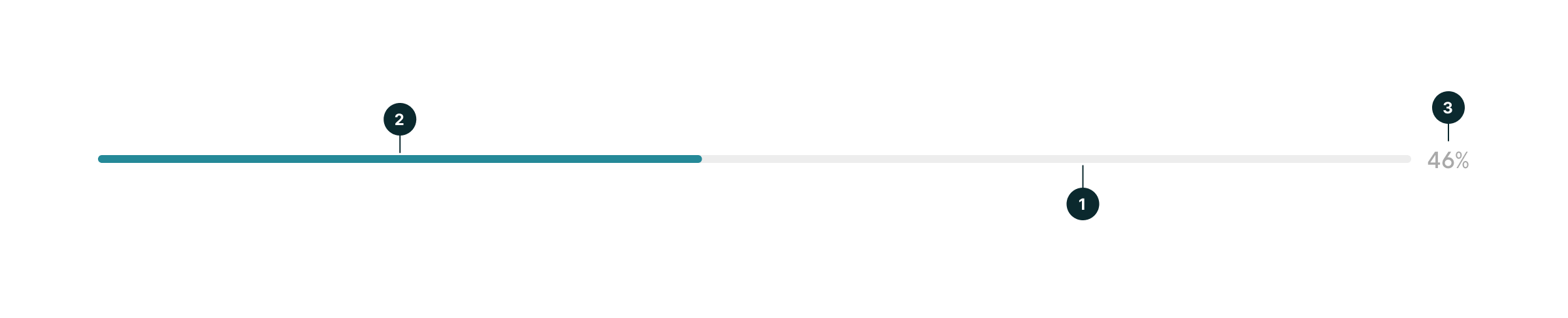
- Track: the full length of the task.
- Fill: the part already done.
- Value (optional): the percentage.
Properties
|
Figma |
Code (nv-progressbar) |
Notes |
|---|---|---|
|
Feedback |
feedback |
neutral, success or error. Success always fills the whole track. |
|
Indeterminate |
indeterminate |
Neutral only. The value is hidden. |
|
Show value, Value |
show-value, value, max |
The fill is value / max. Values outside 0 and max are clamped. |
|
— |
aria-label |
Accessible name, for example “Uploading invoice.pdf”. |
Look and feel
Feedback
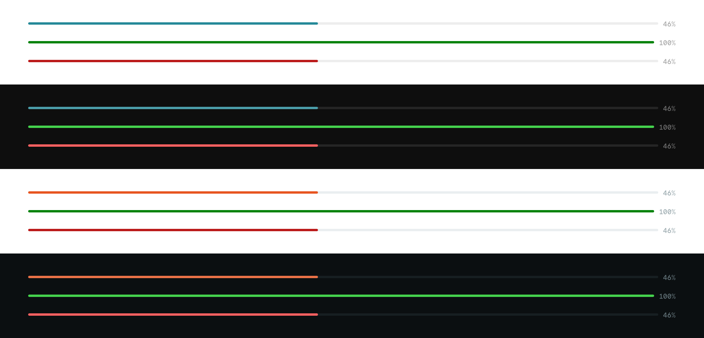
Keep Neutral while the task runs, switch to Success when it completes and to Error when it fails. Success fills the whole track; Error keeps the fill where the task stopped.

Indeterminate
For work whose progress cannot be measured, such as a file being processed by the server. In code the segment loops from left to right; the image shows one frame of the animation. The animation stops when the user prefers reduced motion.

Show value

Themes
Spark and Ocean, in light and dark mode.
Accessibility
- role="progressbar" with aria-valuenow, aria-valuemin and aria-valuemax. aria-valuenow is omitted when indeterminate.
- Name every bar with aria-label or aria-labelledby.
- Feedback is not conveyed by color alone: pair Success and Error with a text status.
Usage
Do
Use a determinate bar when the progress is known, and switch to Success only once the task is really done.
Don't
Don't use an indeterminate bar for a finished or failed task, and don't infer success from reaching 100%.
Related
- File upload: uses the Progress bar in each File tile.
- Loader: for activity without a progress track.
Links
The Figma file contains the latest UI designs, while the links to Web Component, Blazor, Angular, React, and VueJS provide a live demo of components in various states, themes, and interactions.
Feedback
Have feedback, an idea, or a bug to report? Head over to our Contributions page.